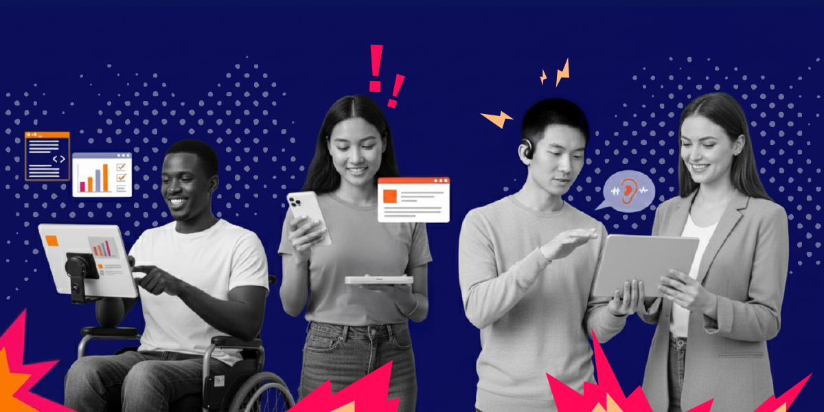
Picture this: You’re scrolling through your phone, trying to complete a simple task—maybe ordering coffee or checking your bank balance. But the text is impossibly small, the buttons are microscopic, and half the screen seems to be missing crucial information. Frustrating, right? What you’re experiencing is exactly why every business needs to build a proper accessibility app from day one.
Now imagine that frustration multiplied by a hundred. That’s the daily reality for millions of users when they encounter apps that weren’t designed with WCAG guidelines from the ground up.
Here’s a number that should make every startup founder and executive sit up straight: An estimated 1.3 billion people—about 16% of the global population—currently experience significant disability. We’re not talking about a niche market here. We’re talking about a massive, engaged, and often completely ignored consumer base.
The cost of getting WCAG compliance wrong is brutal. Research shows that 61% of people won’t return to an inaccessible mobile site. Even worse? If you’re hit with an ADA lawsuit, you’re looking at fines up to $100,000 for repeat violations.
But here’s where it gets interesting. The companies that do get accessibility app design right using WCAG principles? They’re seeing some pretty incredible returns.
Accessible mobile app solutions can increase customer retention by up to 36%. While your competitors are hemorrhaging users due to poor color contrast, missing alt text, and broken keyboard navigation, you could be building a loyal customer base that actually sticks around.
The secret weapon? WCAG’s four core principles—Perceivable, Operable, Understandable, and Robust. These aren’t just boring compliance requirements. They’re your design framework for creating an accessibility app that works better for everyone.
Think about WCAG’s color contrast requirements (4.5:1 ratio for normal text). That doesn’t just help colorblind users—it makes your app readable in bright sunlight for everyone. Or consider proper touch target sizing (minimum 44×44 pixels)—that helps users with motor disabilities, but also anyone trying to use your app while walking or wearing gloves.
As digital accessibility expert Meryl Evans puts it: “Accessibility gives everyone equal access regardless of the circumstances. Accessibility gives people choices.”
In this guide, we’re walking through exactly how to implement WCAG 2.1 Level AA standards in your accessibility app without losing your mind or blowing your budget. We’ll cover specific design techniques for each WCAG principle, show you real examples of compliant vs. non-compliant interfaces, and help you choose a development team that actually understands accessible design patterns.
Ready to build an accessibility app that reaches everyone? Let’s discuss your project needs and create a roadmap for WCAG compliance.
What Is App Accessibility and Why Your Business Can’t Ignore It
Let’s get one thing straight: Mobile app accessibility involves developing and designing applications in a specific way, allowing people of all abilities, including those with disabilities, to use them with ease. It’s not about adding a few features as an afterthought. It’s about building your accessibility app from the ground up so everyone can actually use it.
Who exactly are we talking about here? The numbers might surprise you.
Roughly one-in-five U.S. adults (18%) report that they have a disability that could impact how they interact with your app. That’s not some tiny segment you can afford to ignore—that’s nearly one in five Americans. And here’s the kicker: 72% of differently abled Americans use a smartphone. They’re already out there, trying to use mobile apps every single day.
But here’s where it gets really interesting for your bottom line.
94% of individuals consider the accessibility of apps and mobile sites when deciding which businesses to support. Read that again. Nearly everyone—not just people with disabilities—actually cares about whether your app is accessible. It’s become a deciding factor in where people spend their money.
Here’s why this matters so much: accessibility drives innovation that helps everyone. You know those curb cuts at the end of sidewalks? They were designed for wheelchair users, but now they’re used by cyclists, people with suitcases, and parents with strollers. That’s the curb-cut effect in action.
The same thing happens with digital accessibility. Voice assistants were originally created for people with sensory and mobility impairments—now everyone uses them to set timers and control their smart homes. Subtitles were made for deaf and hard-of-hearing people, but now everyone uses them on trains, at night, or just to focus better. Audio books started as tools for blind users and became a multitasking essential for millions.
When you design your accessibility app for users with disabilities, you’re not just helping them—you’re creating features that make your app better for everyone.
Think about the barriers that might be blocking these users from your app right now. Maybe it’s buttons that are too small to tap accurately. Or images without descriptions that leave screen reader users completely lost. Perhaps it’s color combinations that are impossible to read, or complex gestures that someone with motor disabilities simply can’t perform.
These aren’t edge cases. These are real people trying to order your product, use your service, or engage with your brand—and hitting walls every step of the way.
The WHO disability statistics paint an even broader picture: globally, we’re looking at over a billion people who could benefit from better accessibility. That’s a market bigger than most countries.
When you ignore accessibility, you’re not just missing out on users. You’re actively turning away a massive, loyal customer base that remembers companies who actually care about their experience. More importantly, you’re missing the chance to build innovations that could benefit all your users.
Disability drives innovation. Accessibility helps everyone.
The Legal Reality: Why WCAG Compliance Isn’t Optional
Let’s talk about the legal landscape without the doom and gloom. Accessibility compliance has real legal implications, but understanding them helps you make smart decisions about your accessibility app development.
The landmark case everyone points to is Robles v. Domino’s Pizza. A visually impaired customer couldn’t use Domino’s app with his screen reader to order pizza. The Ninth Circuit Court of Appeals ruled that the ADA applies to digital services, establishing important precedent for mobile apps.
But here’s what’s often missed: this wasn’t about perfect compliance. It was about basic usability—like being able to navigate menus and complete purchases with assistive technology.
Understanding the Real Legal Framework
The Department of Justice has maintained for over two decades that the ADA covers digital accessibility. Their 2010 Advanced Notice of Proposed Rulemaking clarified that websites and mobile apps are places of public accommodation.
Recent enforcement shows they’re serious:
- Target settled for $6 million in 2006 (still the largest accessibility settlement)
- Netflix agreed to caption 100% of content by 2014 after DOJ intervention
- Dozens of companies receive demand letters monthly, with settlement amounts typically ranging from $10,000 to $75,000
The pattern is clear: companies that proactively address accessibility face fewer legal challenges.
WCAG as Your Legal Shield
Courts consistently reference WCAG 2.1 Level AA as the accessibility standard, even though it’s not legally mandated. Why? Because it provides clear, measurable criteria for what makes an accessibility app truly accessible.
Smart legal protection strategies:
- Document your WCAG compliance efforts and testing processes
- Conduct regular accessibility audits with both automated tools and real users
- Implement a clear process for handling accessibility-related user feedback
- Train your development team on WCAG principles and testing methods
Practical Risk Mitigation
Instead of panic, here’s your action plan:
Immediate steps (this week):
- Run automated accessibility tests on your current app
- Check if your app works with VoiceOver (iOS) and TalkBack (Android)
- Review your customer support tickets for accessibility-related complaints
30-day plan:
- Conduct a comprehensive WCAG 2.1 Level AA audit
- Prioritize fixes based on user impact and legal risk
- Establish accessibility testing in your development workflow
Ongoing protection:
- Regular accessibility audits every 6 months
- User testing with people who have disabilities
- Stay updated on DOJ accessibility guidance and enforcement trends
The goal isn’t perfect compliance overnight—it’s consistent improvement and documented good faith efforts to make your accessibility app work for everyone.
Pro Tip: The most legally vulnerable companies are those that ignore accessibility entirely. Courts are generally more lenient with organizations that can demonstrate ongoing efforts to improve accessibility, even if they’re not perfect yet.
Building WCAG compliance into your accessibility app from day one isn’t just legal protection—it’s smart business that expands your market reach while reducing risk.
WCAG Decoded: Your Blueprint for Accessibility App Success
Alright, let’s talk about WCAG. And no, it’s not some government acronym designed to make your life miserable.
WCAG stands for Web Content Accessibility Guidelines, and they’re actually your best friend when it comes to building an accessibility app that works for everyone. Think of them as the instruction manual you actually want to read.
What WCAG Actually Means
The W3C (that’s the World Wide Web Consortium—basically the folks who keep the internet from falling apart) created these guidelines to “provide a shared, global standard for web content accessibility, making digital content more accessible to a wider range of people with disabilities.”
Here’s the thing that trips up a lot of people: WCAG doesn’t have separate rules for mobile apps. Why? Because the same principles that make websites accessible also make apps accessible. It’s not magic—it’s just good design.
“Digital and website accessibility, while relatively easy to achieve, can be a game-changer in making communications and services universally accessible,” says Dr. Kalyan C. Kankanala, and he’s absolutely right.
Want to dive deeper into the foundation? Check out our comprehensive guide on Understanding Web Content Accessibility Guidelines (WCAG) for the full background.
The Four WCAG Principles (POUR Framework)
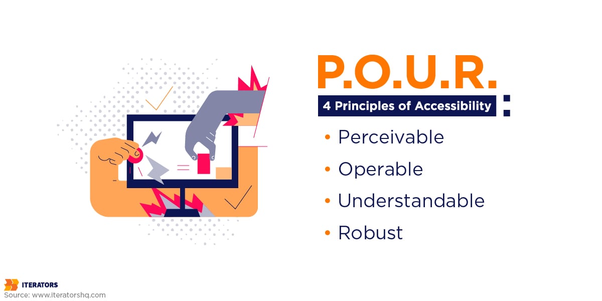
Here’s where it gets simple. Everything in WCAG boils down to four principles. Remember POUR:
Perceivable: Users need to be able to perceive the information you’re showing them. If someone can’t see your red error text because they’re colorblind, that’s a perceivable problem.
Operable: Users need to be able to operate your interface. If your app only works with complex gestures and someone can’t use their hands normally, that’s an operable problem.
Understandable: Users need to understand what’s happening. If your error messages say “Error 404XB” instead of “Please enter a valid email address,” that’s an understandable problem.
Robust: Your content needs to work with different technologies. If your app breaks when someone uses a screen reader, that’s a robust problem.
See? Not rocket science.
WCAG Compliance Levels Explained
WCAG gives you three levels to aim for:
Level A is the bare minimum. Think of it as “your app won’t actively hurt people.”
Level AA is the sweet spot. This is what most legal requirements point to, and it’s achievable for most accessibility app projects without breaking the bank.
Level AAA is the gold standard. It’s tough to achieve for every piece of content, but it’s the ultimate goal for maximum inclusivity.
Most smart companies aim for Level AA. It gives you solid legal protection and covers the vast majority of accessibility needs.
The WCAG 2.1 specifications lay out all the technical details, but here’s the beautiful part: you don’t need to memorize every rule. You just need to understand the principles.
For the complete technical standards, the W3C WCAG Guidelines are your authoritative source.
Making Your Accessibility App Perceivable

The first principle of WCAG is all about making sure users can actually perceive what you’re putting in front of them. This is where most accessibility app projects either nail it or completely fall apart.
Here’s what you need to know as a business leader.
Color Contrast Implementation Guide

Your design team needs clear, measurable standards for color contrast in your accessibility app:
What to require from your design team:
- Test every color combination against WCAG standards before finalizing brand guidelines
- Use professional contrast checking tools like Stark or Colour Contrast Analyser during mockups
- Create a documented color system with pre-approved, compliant combinations
- Never rely solely on color to convey critical information (like making error messages only red)
What to test during development:
- Open your app in bright sunlight – can you still read everything?
- Try using the app with sunglasses on
- Enable high contrast mode on your test devices
- Test with your team members who wear glasses or contacts
The color contrast guidelines provide the complete technical specifications, but the basic rule is simple: if you squint and can’t read it easily, neither can your users.
Business impact: Poor contrast doesn’t just hurt users with vision impairments. It makes your app harder to use for everyone in bright environments, tired users, or anyone over 40 dealing with natural vision changes.
Red flags to watch for: If your design team pushes back on contrast requirements because it “doesn’t look as clean,” that’s a sign they don’t understand accessible design principles.
Alternative Text That Actually Helps
Every image, icon, and graphic in your accessibility app is completely invisible to users who rely on screen readers. Your content strategy needs to account for this from day one.
What good alt text looks like:
- For functional icons: “Delete message” instead of “Trash can icon”
- For informational images: “Q3 sales increased 23% from $50K in July to $67K in September” instead of “Sales chart”
- For decorative images: Tell your developers to mark them as decorative so screen readers skip them entirely
Implementation workflow for your team:
- Content strategy phase: Create alt text guidelines that your writers and designers can follow
- Design phase: Require alt text specifications for every image in mockups
- Development phase: Set up quality checks that flag missing alt text before deployment
- Testing phase: Use actual screen readers to verify descriptions make sense
The Mozilla mobile accessibility checklist has the complete technical breakdown, but the principle is straightforward: describe what matters, skip what doesn’t.
Business consideration: Budget extra time for alt text creation. Good descriptions take thought and often require subject matter expertise. A product image isn’t just “laptop photo”—it might be “MacBook Pro 14-inch in Space Gray showing the new product dashboard interface.”
Making Multimedia Accessible
If your accessibility app includes video or audio content, accessibility isn’t optional—it’s a legal requirement and business necessity.
What you need to budget for:
- Professional captioning: $1-3 per minute of video content
- Audio descriptions: $5-8 per minute for complex visual content
- Transcript creation: $3-5 per minute of audio content
Quality standards to require:
- Captions must be synchronized within 3 seconds of spoken audio
- Include speaker identification when multiple people talk
- Describe significant non-speech sounds like [applause] or [phone ringing]
- Captions should be readable at normal viewing sizes
Smart implementation approach:
- Start with auto-captions from services like Rev.com or YouTube, then hire professionals to clean them up (70% cost savings)
- Plan captions during video production, not after—it’s much cheaper
- Create transcripts first, then derive captions from them for consistency
Business case: Captions aren’t just for deaf users. 85% of Facebook videos are watched without sound. Captions make your content accessible to people in noisy environments, quiet libraries, or anyone who processes written information better than audio.
Case Study: When we helped Obi redesign their video learning platform with comprehensive accessibility features, they saw 500,000+ downloads and 40% higher completion rates. Users appreciated having multiple ways to consume content—whether they needed accommodations or just preferred reading along.
The key is building these considerations into your project timeline and budget from day one, not trying to retrofit them later.
Ensuring Your Accessibility App Is Operable
Here’s where your accessibility app either becomes genuinely usable or turns into a beautiful frustration machine. Operability is about making sure everyone can actually complete tasks in your app.
Navigation That Works for Everyone
Not everyone navigates apps by tapping and swiping. Some users rely on keyboards, switches, or voice commands. Others might be using their phone one-handed while holding a baby, or wearing gloves in winter.
What to require from your development team:
- Every interactive element must work with keyboard navigation
- Focus indicators must be clearly visible as users tab through the interface
- Tab order must follow a logical path (left to right, top to bottom)
- Users must never get trapped in a section they can’t exit
Testing checklist for your QA team:
- Daily testing (5 minutes): Connect a Bluetooth keyboard to your test device and navigate through one core user flow using only Tab and Enter
- Weekly testing (30 minutes): Test all major user flows with keyboard-only navigation
- Monthly testing: Try iOS Switch Control and Android Switch Access features
The mobile accessibility barriers research shows this is one of the most common problems apps face.
Business impact: Good keyboard navigation isn’t just for users with disabilities. It makes your app faster to use for power users and provides backup interaction methods when touch isn’t ideal.
Touch Targets That Actually Work
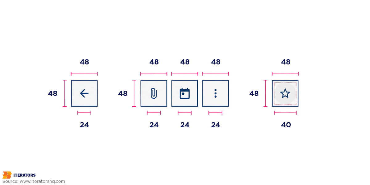
WCAG requires touch targets to be at least 44×44 pixels—about the size of a fingertip. But that’s just the minimum.
Design requirements for your team:
- All buttons and links must meet the 44-pixel minimum
- Interactive elements need breathing room—at least 8 pixels between adjacent targets
- Complex gestures (like pinch-to-zoom) must have simple alternatives
- Consider thumb reach on different device sizes
Real-world testing protocol:
- One-handed test: Try using your accessibility app with your non-dominant hand only
- Glove test: Attempt all primary actions while wearing winter gloves
- Crowded transport test: Use the app while standing on a moving bus or train
- Fatigue test: Try using the app when you’re genuinely tired
Business consideration: Touch target issues affect everyone, not just users with motor disabilities. Small buttons frustrate everyone, but they make your app completely unusable for people with conditions like arthritis or Parkinson’s.
Voice Control and Screen Reader Compatibility
Your accessibility app needs to work seamlessly with assistive technologies that users already have on their devices.
What your development team needs to implement:
- Proper labels for every interactive element (buttons should announce their purpose)
- Status updates that tell users when actions complete successfully
- Clear error messages that explain what went wrong and how to fix it
- Support for platform accessibility features like VoiceOver and TalkBack
Testing requirements:
- Weekly screen reader testing: Navigate your entire app with VoiceOver (iOS) or TalkBack (Android) enabled
- Voice control testing: Try completing major tasks using only voice commands
- Integration testing: Verify your app doesn’t interfere with system-wide accessibility settings
The W3C mobile accessibility guidelines cover all the technical specifications, but the principle is simple: make your interface describe what it actually does.
Pro tip for business leaders: Record your development team navigating your accessibility app with VoiceOver enabled. Listen back with your eyes closed. If you get lost or confused, so will your users.
Business impact: When assistive technology integration is done right, it often improves the app for everyone. Better labeling makes interfaces clearer. Status announcements reduce confusion. Predictable navigation helps all users learn your app faster.
The goal isn’t perfect accessibility on day one—it’s building systematic testing and improvement into your development process so every feature you ship works better for everyone.
Creating an Understandable Accessibility App

You know what’s worse than an app that doesn’t work? An app that kind of works but leaves users constantly confused about what’s happening.
This is where the “Understandable” principle separates amateur accessibility app development from professional implementation.
Error Messages That Actually Help Users
Most apps have terrible error messages. Here’s how to fix yours:
Before and after examples your team should follow:
- Terrible: “Error 422: Validation failed on entity processing.”
- Better: “Please check your email address and try again.”
- Best: “Email addresses need an @ symbol and a domain (like gmail.com). Please check yours and try again.”
- Terrible: Submit button grayed out with no explanation.
- Better: “Please fill in all required fields.”
- Best: “Please complete these required fields: Email address, Password”
Content guidelines for your team:
- Replace technical jargon with everyday words (“sign in” not “authenticate”)
- Use active voice (“Click Save” not “The save function should be activated”)
- Keep sentences under 20 words when possible
- Always provide examples for complex formats (phone numbers, dates, passwords)
- Test message clarity with people unfamiliar with your product
Business testing method: Ask someone unfamiliar with your accessibility app to complete a task while thinking aloud. Every time they say “I don’t understand” or pause confused, you’ve found a problem worth fixing.
Predictable Design Patterns
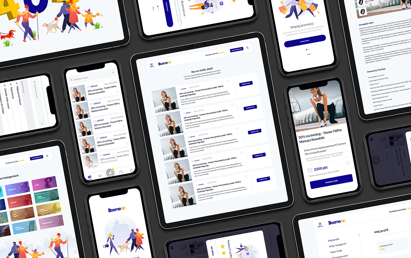
Consistency isn’t just about using the same colors—it’s about creating learnable patterns that reduce mental effort:
What consistency looks like:
- Back arrow always in the same corner
- Primary action button always in the same position
- Same icons mean the same things throughout the app
- Similar tasks follow similar workflows
What inconsistency costs you:
- Users have to relearn how to use your app on every screen
- Support tickets increase because people can’t predict how things work
- Task completion rates drop because users lose confidence
Implementation checklist for your team:
- Icon audit: List every icon in your app and what it does—eliminate duplicates and conflicts
- Language audit: Document how you describe similar actions (Save vs. Submit vs. Update)
- Flow audit: Map how users complete similar tasks across different sections
- Pattern library: Create documented design standards that everyone follows
The mobile app accessibility checklist breaks down the technical requirements, but the human principle is simple: don’t make people relearn how to use your app on every screen.
Business impact: Predictable design reduces support costs, increases user confidence, and helps people accomplish tasks faster. When someone with a cognitive disability figures out how to use one part of your accessibility app, that success should build confidence for the rest of it.
Cognitive Load Reduction
Most app designers think more information is always better. It’s not.
Smart information architecture:
- Break complex forms into 3-4 steps instead of one overwhelming page
- Show progress indicators so users know where they are in a process
- Use smart defaults and auto-fill to reduce typing
- Group related information with clear visual separation
Testing cognitive load:
- 5-second test: Show someone a screen for 5 seconds. Can they tell you what the primary action is?
- Interruption test: Have users start a task, interrupt them halfway through, then ask them to continue. How easily can they pick up where they left off?
- Stress test: Test your app when users are tired, distracted, or in a hurry
Business consideration: Reducing cognitive load helps everyone, not just people with disabilities. It helps tired parents, stressed executives, and anyone trying to use your app while distracted. Simpler interfaces have higher conversion rates and lower abandonment.
Quick implementation win: Audit your most complex screen. Count every piece of text, every button, every input field. If it’s more than 7-10 elements, you probably need to break it up.
Remember: reducing cognitive load isn’t about dumbing down your accessibility app—it’s about respecting users’ mental energy and making success feel effortless.
Building a Robust Accessibility App for the Future
Here’s the thing about building an accessibility app: the assistive technologies your users rely on today are evolving fast, and you need to build for tomorrow’s innovations without breaking today’s tools.
Platform Integration Strategy
Your users have already told their devices how they need to interact with apps. Your accessibility app needs to respect and work with those preferences.
What your development team needs to implement:
- Text that scales from 50% to 300% without breaking layouts
- Compatibility with system-wide zoom up to 500%
- Proper behavior with high contrast modes
- Integration with voice control systems
- Support for external switch navigation hardware
Testing requirements for your QA team:
- Weekly platform testing: Enable each system accessibility feature and verify your app still functions
- Scaling tests: Check that your app works at extreme text sizes and zoom levels
- Integration tests: Ensure your app doesn’t override or conflict with user accessibility settings
Business consideration: Platform integration isn’t just about compliance—it’s about respecting user choices. When someone has customized their device to work for them, your app should honor those preferences, not fight against them.
Future-Proofing Through Standards-Based Design
The secret to building for unknown technologies? Use established web standards that describe what things are, not just how they look.
What to require from your development team:
- Use proper HTML structure that describes content hierarchy
- Implement semantic markup that explains the purpose of interface elements
- Structure data in ways that AI and future technologies can understand
- Build interfaces that work without requiring specific interaction methods
Emerging technology preparation:
- Voice interfaces: Structure content so it makes sense when read aloud
- AI assistance: Organize information so automated systems can parse user intent
- Adaptive interfaces: Design systems that can adjust to individual user needs automatically
Here’s where things get exciting. We’re seeing artificial intelligence revolutionize accessibility in ways we never imagined. AI-powered screen readers, predictive text for people with motor disabilities, and smart image recognition are changing how people interact with apps.
Want to explore how AI is shaping the future of accessibility? Check out our deep dive on How Artificial Intelligence Can Help Improve Accessibility and Mental Health.
Business testing approach: Every quarter, try using your accessibility app with:
- Voice control only (no touch or typing)
- Maximum system zoom enabled
- Screen reader with eyes closed
- One-handed operation only
- Simulated difficulties (wearing oven mitts, mild hand tremor)
Building for Unknown Assistive Technologies
The strategic approach:
- Use native interface elements whenever possible—they automatically work with new assistive technologies
- Provide multiple ways to access information—text, audio, visual indicators
- Make your data machine-readable through proper structure and labeling
- Test with edge cases regularly to identify weak points before they become problems
Investment priorities:
- Semantic structure: Worth the upfront cost because it provides long-term adaptability
- Multi-modal interfaces: Expensive initially but creates competitive advantages
- Standards compliance: Reduces technical debt and future refactoring costs
- Regular accessibility audits: Cheaper than retrofitting accessibility later
For the complete technical specifications on applying WCAG to mobile apps, the WCAG2ICT Guidelines provide the authoritative framework.
Business impact: Robust design isn’t just about future-proofing—it’s about creating competitive advantages. While your competitors struggle to support new assistive technologies, your accessibility app adapts automatically because it was built on solid foundations.
Long-term ROI: Companies that invest in robust, accessible design see:
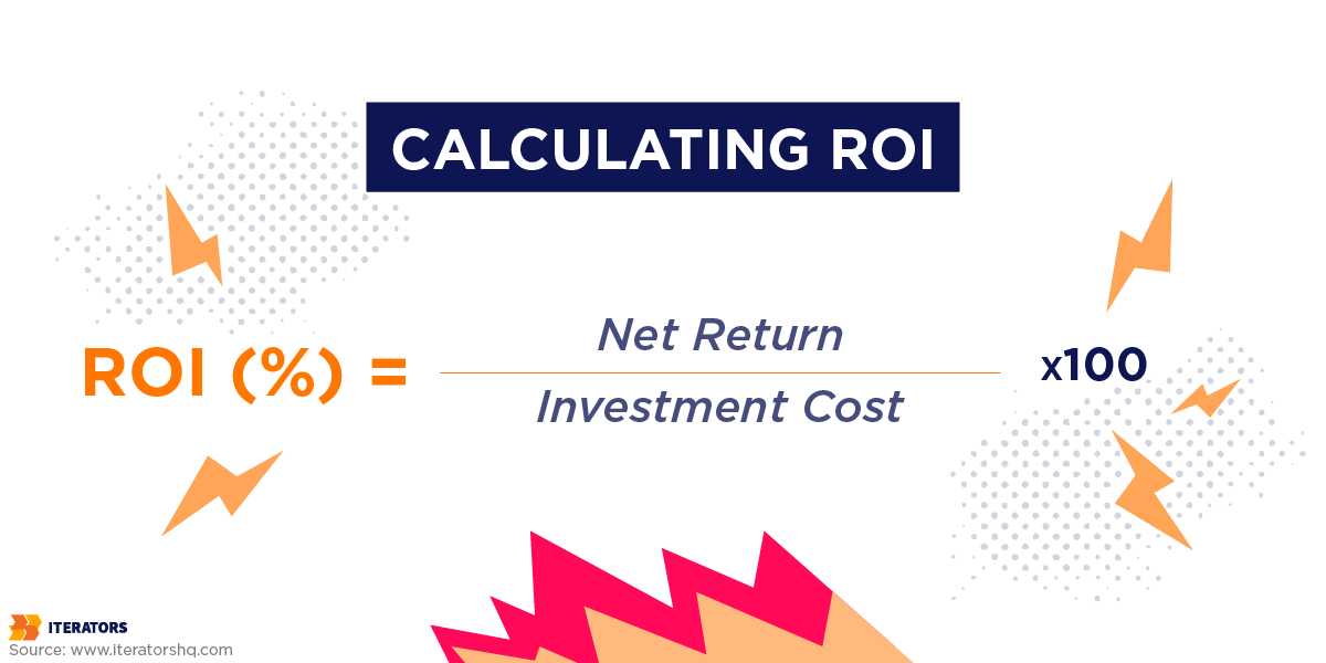
- Lower maintenance costs as platforms evolve
- Faster feature development because accessibility is built into the process
- Higher user retention as the app adapts to changing needs
- Better brand reputation among users who value inclusive design
The goal isn’t predicting specific future technologies—it’s building foundations robust enough to adapt when those technologies arrive. When you invest in standards-based, semantic design today, you’re creating an accessibility app that can evolve with whatever comes next.
Testing Your Accessibility App: Tools and Techniques
Building an accessibility app is one thing. Making sure it actually works for real people? That’s where testing comes in.
And here’s the brutal truth: most companies get this completely wrong because they treat accessibility testing as an afterthought instead of a systematic process.
Automated Testing Strategy
Automated tools are your quality assurance safety net, but you need the right combination and testing schedule to make them effective.
Essential automated testing tools your team should use:
For immediate feedback during development:
- axe DevTools: Catches 30-40% of accessibility issues automatically
- WAVE (Web Accessibility Evaluation Tool): Provides visual feedback on accessibility problems
- Lighthouse Accessibility Audit: Built into Chrome, gives you a baseline accessibility score
- Color Oracle: Simulates colorblindness to test your color choices
For continuous monitoring:
- axe-core integrated into your CI/CD pipeline: Automatically flags accessibility regressions before deployment
- Pa11y command line tool: Runs accessibility tests on multiple pages simultaneously
- Accessibility Insights: Microsoft’s tool that combines automated and manual testing
What automated testing catches well:
- Missing alt text on images
- Insufficient color contrast ratios
- Unlabeled form inputs
- Broken focus management
- Missing headings hierarchy
What automated testing misses entirely:
- Whether your app actually makes sense to use
- If error messages are helpful or confusing
- Whether the content flow is logical
- If complex interactions work with assistive technology
- Whether users can actually complete tasks
Business implementation strategy:
- Week 1: Set up automated testing in your development environment
- Week 2: Integrate accessibility checks into your deployment pipeline
- Week 3: Train your QA team to interpret automated testing results
- Ongoing: Review automated test results weekly, but never rely on them alone
AI-powered accessibility testing is emerging as a powerful complement to traditional automated methods, helping bridge the gap between technical compliance and actual usability.
Manual Testing Methodologies
This is where you discover whether your accessibility app actually works for real people in real situations.
Systematic manual testing approach:
Daily Testing Protocol (15 minutes):
- Navigate one core user flow with screen reader enabled
- Test the same flow using only keyboard navigation
- Check one feature with voice control enabled
- Verify text scaling works up to 200% without breaking layouts
Weekly Deep Testing (2 hours):
- Screen reader testing: Complete all major tasks using VoiceOver (iOS) and TalkBack (Android)
- Keyboard navigation: Test every interactive element works with Tab, Enter, and Arrow keys
- Voice control: Attempt primary actions using only voice commands
- Motor accessibility: Test with simulated motor difficulties (oven mitts, one hand only)
- Cognitive load testing: Time how long complex tasks take and identify confusion points
Monthly Comprehensive Testing (1 day):
- Test on multiple device types and screen sizes
- Verify compatibility with external assistive hardware
- Check performance with multiple accessibility features enabled simultaneously
- Test edge cases like poor network connectivity with accessibility features
Gian Wild’s methodology provides the systematic framework: “Test on variety of real mobile devices, conduct tests with assistive technologies, test responsive windows on desktop.”
Specific testing scenarios your team should run:
Visual Accessibility Testing:
- Use your app in direct sunlight
- Test with sunglasses on
- Enable high contrast mode and verify all information is still accessible
- Test with screen magnification at 300-500%
- Simulate colorblindness with Color Oracle
Motor Accessibility Testing:
- One-handed usage (dominant and non-dominant)
- Wearing winter gloves
- While walking or on public transportation
- Simulating hand tremors or reduced fine motor control
- Using external keyboard or switch devices
Cognitive Accessibility Testing:
- Complete tasks while distracted (music playing, TV on)
- Test when genuinely tired or stressed
- Have team members unfamiliar with the app attempt core tasks
- Time task completion and identify points of confusion
The comprehensive mobile app accessibility guide breaks down the complete technical testing process, but here’s what matters for business leaders: can your target users actually accomplish what they came to do?
Real User Testing Implementation
This is where you get the insights that separate good accessibility app development from great accessibility app development.
How to find and work with accessibility testers:
Recruitment strategies:
- Disability organizations: Contact local chapters of the National Federation of the Blind, United Spinal Association, or similar groups
- University disability services: Partner with college accessibility offices
- Online communities: Platforms like AccessibilityOz or Fable connect you with professional accessibility testers
- User research agencies: Companies like UserTesting now offer accessibility-focused testing services
What to pay accessibility testers:
- Professional testers: $75-150 per hour for structured testing sessions
- Community volunteers: $25-50 gift cards for 30-minute feedback sessions
- Focus groups: $100-200 per participant for 2-hour sessions
Testing session structure that gets results:
Pre-session preparation:
- Provide clear task scenarios, not just “use our app”
- Set up screen recording to capture both audio and visual feedback
- Prepare specific questions about workflow pain points
- Have technical team members observing but not interfering
During testing sessions:
- Let users navigate naturally before providing help
- Ask users to think aloud throughout the process
- Focus on task completion, not just technical compliance
- Note when users get frustrated or confused, not just when things break
Post-session analysis:
- Categorize feedback into “critical,” “important,” and “nice-to-have”
- Look for patterns across multiple users
- Prioritize fixes based on impact on core user tasks
- Document both what works well and what needs improvement
They’ll catch workflow issues like:
- Confusing navigation that technically works but makes no logical sense
- Error messages that are technically correct but practically useless
- Features that work individually but create overwhelming cognitive load together
- Interaction patterns that work fine for some disabilities but create barriers for others
Business case for real user testing: Companies like those featured in Fable Tech Labs’ mobile accessibility insights consistently find that user feedback reveals the difference between technically compliant and genuinely usable. The ROI is clear: fixing usability issues based on real user feedback reduces support costs and increases user retention significantly.
Implementation timeline:
- Month 1: Set up automated testing and basic manual testing protocols
- Month 2: Recruit accessibility testers and conduct first user testing sessions
- Month 3: Implement priority fixes and establish ongoing testing schedule
- Ongoing: Monthly user testing sessions with quarterly comprehensive audits
The bottom line: Testing isn’t a checkbox exercise—it’s quality assurance for user experience. The companies that invest in systematic, ongoing accessibility testing don’t just avoid legal problems; they create accessibility app experiences that users actually prefer and recommend to others.
Common Accessibility App Mistakes to Avoid
Let’s talk about the ways companies completely screw up accessibility app development. I’ve seen multi-million dollar projects derailed by these mistakes, and the patterns are depressingly predictable.
The “We’ll Fix It Later” Trap
Here’s the most expensive mistake: treating accessibility like something you can retrofit after launch.
Real-world cost breakdown: A Fortune 500 client came to us with a completed e-commerce app that needed accessibility fixes. The original development cost $2.3 million. Making it accessible after the fact? Another $1.8 million and eight months of delays.
Why so expensive? Because accessible design affects everything:
- Navigation structure had to be completely rebuilt for screen readers
- Color-coded product categories needed icon alternatives
- The entire checkout flow required redesign for keyboard navigation
- Database schema needed updates to support alt text for thousands of product images
The math is brutal: According to the Web Accessibility Initiative, retrofitting accessibility costs 5-10 times more than building it in from the start. For every $100,000 you spend on initial development, expect to spend $500,000-$1,000,000 fixing accessibility issues later.
Picture this scenario we see constantly: You’ve built your entire app. Design is locked. Code is written. You’re two weeks from launch. Then your legal team says, “Hey, shouldn’t this be accessible before we go public?”
Congratulations. You just turned a two-week launch into a six-month rebuild.
What “we’ll fix it later” actually means:
- Redesigning core user flows that don’t work with assistive technology
- Refactoring database structures to support accessibility metadata
- Retraining your entire development team on accessible coding practices
- Delaying market entry while competitors who built accessibility in from day one launch successfully
The Overlay Trap That’s Costing Companies Millions
Some company has probably pitched you on an “accessibility overlay” by now. You know, those widgets that promise to make your accessibility app instantly compliant with one line of code?
Here’s what they don’t tell you: Major accessibility advocacy groups, including the National Federation of the Blind, have filed lawsuits specifically against companies using these overlays.
Recent legal precedent: Eyebobs (eyewear company) got sued in 2021 despite having an accessibility overlay installed. The court ruled that overlays don’t provide meaningful accessibility. The company had to remove the overlay AND implement proper accessibility fixes. Total cost: over $300,000 in legal fees plus development costs.
Why overlays backfire:
- They often break existing accessibility features that work fine
- Screen reader users report overlays making sites harder to navigate, not easier
- They create a false sense of legal protection that doesn’t hold up in court
- They add loading time and complexity to your app without solving core problems
Accessibility is not a one-time project; it’s an ongoing commitment and iterative process. Companies that understand this build systematic accessibility into their development process. Companies that don’t end up paying lawyers instead of developers.
The Alt Text Disaster That Killed a Product Launch
This isn’t theoretical. A major fitness app we consulted with had to delay their launch by four months because of missing alt text.
What happened: They had 50,000+ workout images and videos with no descriptions. When they finally tested with screen readers, users couldn’t tell the difference between a bicep curl and a squat thrust. The app was literally unusable for visually impaired users.
The business impact:
- 4-month launch delay while they created descriptions for all content
- $180,000 in additional content creation costs
- Lost first-mover advantage in their market category
- Had to rebuild their content management system to require alt text for all future uploads
The fix should have cost: About $15,000 if planned during initial content creation.
What good alt text strategy looks like: Build alt text requirements into your content creation process from day one. For every image or video you create, budget 5-10 minutes for writing meaningful descriptions. It’s cheaper than having a content team fix 50,000 images later.
Color Contrast Failures That Tanked User Testing
A healthcare app startup we worked with spent $400,000 on development, then watched their user testing sessions fall apart because users couldn’t read critical health information.
The specific problem: They used #777777 gray text on #ffffff white backgrounds (2.85:1 contrast ratio). WCAG requires 4.5:1 for normal text.
User testing results:
- 67% of participants over 50 couldn’t read medication dosage information
- Users with mild vision impairments abandoned tasks at 3x the normal rate
- Even users without disabilities complained about eye strain
The business cost:
- Complete visual redesign: $85,000
- Delayed FDA submission by 6 months
- Lost potential partnerships with healthcare systems that required accessibility compliance
Your designer’s minimalist aesthetic doesn’t matter if users can’t actually read your content. Test every color combination with actual contrast checking tools. If you squint and can’t read it easily, neither can your users—and neither can their lawyers.
Complex Gestures That Created Legal Liability
A fintech startup built their entire accessibility app interface around innovative swipe gestures. Cool for demos, disastrous for accessibility.
What went wrong: Their primary account management features required pinch-to-zoom, multi-finger swipes, and complex gesture combinations. Users with motor disabilities literally couldn’t access their own financial accounts.
The legal consequence: They received an ADA demand letter citing their app as “fundamentally inaccessible to users with motor disabilities.” Settlement cost: $150,000 plus mandatory accessibility updates.
The irony: Adding button alternatives for every gesture would have cost less than $5,000 during initial development.
Smart gesture strategy: Always provide simple alternatives. That pinch-to-zoom should also work with double-tap. That swipe action should have a visible button option. Complex gestures can enhance the experience for some users, but they can’t be the only way to accomplish essential tasks.
The Real Cost of Getting This Wrong
Accessibility lawsuits have increased 320% since 2018. The average settlement is $75,000-$150,000, plus legal fees that often exceed the settlement amount.
But the hidden costs are worse:
- Brand reputation damage: Accessibility failures get widely shared in disability communities
- Lost market share: 61% of users won’t return to inaccessible sites
- Development team turnover: Good developers don’t want to work on projects that exclude users
- Investor concerns: VCs increasingly ask about accessibility compliance during due diligence
Pro Tip from the trenches: Accessibility is exponentially cheaper to build in than bolt on later. Every accessibility consideration you make during wireframing saves you 10+ hours of refactoring later.
The companies that get accessibility right? They start thinking about it during the market research phase, not after the app store submission. They build accessibility requirements into their MVP definition. They hire developers who understand that accessibility isn’t a feature—it’s a baseline requirement for professional software development.
When you skip accessibility planning, you’re not just risking legal problems. You’re betting your entire market entry timeline on never encountering a user with a disability. That’s not just morally questionable—it’s terrible business strategy.
Choosing the Right Development Team for Your Accessibility App
Here’s a hard truth: not all developers understand accessibility. And hiring the wrong team can turn your accessibility app project into an expensive nightmare.
So what should you look for?
Key Skills That Actually Matter
First, your development team needs real WCAG expertise. Not the kind where they Googled it last week. The kind where they can explain the difference between aria-label and aria-describedby without checking Stack Overflow.
They should understand assistive technologies—not just how to test with them, but how people actually use them in their daily lives. There’s a big difference between running a quick VoiceOver test and understanding how someone navigates an entire accessibility app workflow with a screen reader.
Look for teams that talk about semantic HTML like it matters. Because it does. If they’re focused only on how things look and not how they work with assistive technologies, that’s a red flag.
Questions That Separate the Real Experts from the Pretenders
Ask them about their testing methodology. Do they test with real users who have disabilities? Do they have a systematic approach to accessibility testing, or do they just run automated tools and call it done?
Here’s a good one: “How do you handle keyboard navigation in mobile apps?” If they look confused, keep looking.
Ask about their experience with platform-specific accessibility features. iOS and Android handle things differently, and your team should know those differences.
The Iterators Approach
“We join our client’s efforts to become successful, as if we were their co-founders, tech partners, and allies.” That’s not just marketing speak—it’s how accessibility should be approached.
The right development team doesn’t see accessibility as a checkbox to mark off. They see it as fundamental to building something that actually works for your users. If you’re looking for partners who understand that accessibility and great user experience go hand in hand, we’d be happy to discuss your project.
Case Study: When we partnered with Virbe to build their platform from the ground up with accessibility in mind, they ended up exceeding performance expectations by 10%. That’s what happens when you work with a team that understands accessibility isn’t just about compliance—it’s about creating better experiences for everyone.
Red Flags to Watch Out For
Run if they suggest adding accessibility “at the end” of the project. Run if they promise that automated tools will handle everything. Run if they’ve never worked with users who have disabilities.
The right team talks about accessibility from day one. They ask about your target users. They want to understand not just what you’re building, but who you’re building it for.
Remember: building an accessibility app isn’t just about following guidelines. It’s about understanding that accessibility and great user experience aren’t separate things—they’re the same thing.
The Business Case: ROI of Accessibility App Development

Let’s talk money. Because at the end of the day, that’s what gets budgets approved and projects greenlit.
Building an accessibility app isn’t just the right thing to do—it’s smart business.
The Numbers Don’t Lie
The global disability market represents $8 trillion in annual spending power. That’s not a typo. We’re talking about a market bigger than the entire GDP of most countries.
But here’s where it gets really interesting for your bottom line.
Accessible mobile app solutions can increase customer retention by up to 36%. Think about your current retention rates. Now imagine boosting them by more than a third just by making your app work for everyone.
On the flip side, research shows that 61% of people won’t return to an inaccessible mobile site. That means you’re not just missing out on new users—you’re actively driving away potential customers.
Hidden Benefits That Add Up
SEO gets better when you build accessible. Search engines love properly structured content with good alt text and semantic markup. Your accessibility app becomes more discoverable.
Customer support calls drop. When your app is intuitive and works for everyone, people need less help figuring it out.
Brand reputation improves. Word spreads fast in the disability community about companies that actually care. And it spreads even faster about companies that don’t.
Legal Risk Mitigation
Remember those ADA fines we talked about earlier? Up to $100,000 for repeat violations, plus legal fees and court costs.
Building accessibility into your accessibility app from day one is like buying insurance. Except this insurance also makes you money.
The Competitive Advantage
Most of your competitors are ignoring accessibility. That’s your opportunity.
When someone with a disability finds an app that actually works for them, they become incredibly loyal customers. They tell their friends. They become advocates for your brand.
This is exactly the kind of unfair advantage that can set your business apart while competitors struggle to catch up.
You’re not just capturing market share—you’re capturing the most engaged, loyal segment of users you could ask for.
The math is simple: accessibility costs less to build in than to retrofit, provides measurable ROI through improved retention and expanded market reach, and protects you from potentially devastating legal costs.
That’s not feel-good marketing. That’s smart business.
Getting Started: Your Accessibility App Action Plan

Alright, you’re convinced. Accessibility matters for your business, your users, and your legal protection. But where the hell do you actually start?
Here’s your structured 90-day implementation roadmap with specific tools, budgets, and team assignments.
Phase 1: Assessment and Foundation (Days 1-30)
Week 1: Baseline Accessibility Audit
Tools you’ll need:
- axe DevTools (Free): Install this Chrome extension and scan your app’s key screens
- WAVE Web Accessibility Evaluator (Free): Provides visual feedback on accessibility issues
- Colour Contrast Analyser (Free): Test your color combinations against WCAG standards
- Lighthouse Accessibility Audit (Free): Built into Chrome, gives you a baseline score
Team assignment: Have your QA team run these tools on your top 10 most-used screens. Budget 8 hours for initial testing.
What you’ll discover: Expect to find 15-30 issues per screen on your first audit. Don’t panic—this is normal for apps that haven’t prioritized accessibility.
Deliverable: A prioritized list of accessibility issues ranked by user impact and fix complexity.
Week 2-3: Manual Testing Protocol
Testing checklist for your team:
- Navigate your entire accessibility app using only a keyboard (Tab, Enter, Arrow keys)
- Turn on VoiceOver (iOS) or TalkBack (Android) and complete core user tasks
- Enable voice control and attempt primary actions
- Test with system zoom at 200% and 300%
- Try using the app one-handed and with simulated motor difficulties
Budget consideration: Assign 2-3 team members to spend 4 hours each on manual testing. Total cost: approximately $1,200-1,800 in internal time.
Reality check: You’ll probably be horrified by what you discover. That’s normal and exactly why this audit matters.
Week 4: Legal and Competitive Analysis
Research tasks:
- Review ADA lawsuit trends in your industry (check ADA lawsuit databases)
- Analyze competitor apps for accessibility features using the same testing tools
- Consult with legal counsel about your specific compliance risks
- Research accessibility testing services in your area
Budget: $2,000-5,000 for legal consultation, depending on your risk profile.
Phase 2: Quick Wins and Planning (Days 31-60)
Week 5-6: Implement High-Impact Fixes
Priority fixes that provide immediate ROI:
- Color contrast issues: Often fixable by adjusting existing color values (2-4 hours per screen)
- Missing alt text: Start with your most important images and icons (1-2 hours per screen)
- Form labels: Add proper labels to all input fields (30 minutes per form)
- Focus indicators: Make keyboard navigation visible (4-6 hours total)
Tools for implementation:
- Stark (Figma/Sketch plugin, $12/month): Real-time contrast checking during design
- axe-core integration: Add automated testing to your development pipeline
- Screen reader testing: Use built-in VoiceOver/TalkBack for validation
Expected results: These fixes typically improve your accessibility score by 40-60% and cost under $10,000 in development time.
Week 7-8: Team Training and Process Setup
Training investments:
- Accessibility training for developers: Budget $500-1,000 per developer for online courses or workshops
- Design team accessibility certification: Consider programs from WebAIM or Deque University
- QA team testing protocols: Establish systematic accessibility testing procedures
Process improvements:
- Add accessibility checkpoints to your design review process
- Integrate automated accessibility testing into your CI/CD pipeline
- Create accessibility requirements for all new features
Phase 3: Systematic Implementation (Days 61-90)
Week 9-10: WCAG Level AA Compliance Sprint
Work through WCAG principles systematically:
Perceivable fixes (Budget: $15,000-25,000):
- Professional alt text for all images and icons
- Caption existing video content (budget $1-3 per minute)
- Audio descriptions for complex visual content
Operable fixes (Budget: $20,000-35,000):
- Complete keyboard navigation support
- Touch target sizing corrections
- Alternative input method support
Understandable fixes (Budget: $10,000-15,000):
- Error message improvements
- Interface consistency audit and fixes
- Content simplification and restructuring
Robust fixes (Budget: $5,000-10,000):
- Semantic markup improvements
- Platform accessibility feature integration
- Cross-browser/device compatibility testing
Week 11-12: User Testing with Real Users
Implementation strategy:
- Find testers: Contact local disability organizations or use services like Fable or AccessibilityOz
- Budget: $2,000-5,000 for professional accessibility testing sessions
- Testing structure: 2-hour sessions with 5-8 participants covering different disability types
- Focus areas: Task completion, error recovery, and overall user satisfaction
What to expect: Real user feedback will reveal usability issues that automated testing missed entirely.
Phase 4: Launch and Ongoing Maintenance
Ongoing accessibility maintenance plan:
Monthly tasks (Budget: $2,000/month):
- Automated accessibility testing on all new features
- Manual testing with screen readers and keyboard navigation
- User feedback review and response
- Content accessibility review for new materials
Quarterly tasks (Budget: $5,000/quarter):
- Comprehensive accessibility audit
- User testing sessions with people who have disabilities
- Team training updates and skill development
- Legal compliance review and documentation
Annual tasks (Budget: $15,000-25,000/year):
- Third-party accessibility audit
- Comprehensive user research with accessibility focus
- Technology stack updates for improved accessibility support
- Team certification and advanced training
Essential Tools and Resources
Free tools to start immediately:
- WAVE Web Accessibility Evaluator
- axe DevTools
- Lighthouse Accessibility Audit
- Colour Contrast Analyser
Paid tools worth the investment:
- Stark ($12-60/month): Design-integrated accessibility checking
- Deque axe Pro ($100+/month): Advanced automated testing
- Fable ($500+/month): Professional accessibility testing platform
Training resources:
- WebAIM training courses: $295-495 per person
- Deque University: $99-299 per course
- Accessibility-focused conferences: $500-2,000 per person (A11Y Camp, CSUN, etc.)
Budget Summary
- Phase 1 (Assessment): $5,000-8,000
- Phase 2 (Quick wins): $15,000-25,000
- Phase 3 (Full implementation): $50,000-85,000 Phase 4 (Ongoing): $35,000-55,000/year
Total first-year investment: $105,000-173,000 for a comprehensive accessibility app implementation.
ROI considerations: Compare this to the average ADA lawsuit settlement of $75,000-150,000, plus legal fees, plus the business cost of excluding 16% of your potential market.
Success Metrics to Track
Technical metrics:
- Accessibility score improvement (target: 90+ on Lighthouse)
- Number of WCAG violations (target: under 5 per major screen)
- User task completion rates with assistive technology
Business metrics:
- User retention rates among accessibility feature users
- Customer support tickets related to usability issues
- App store ratings and reviews mentioning accessibility
- Legal risk assessment scores
The best time to start was yesterday. The second-best time is right now. Choose your phase 1 team members, set your first sprint planning meeting, and begin building an accessibility app that reaches everyone.
The Takeaway
Building an accessibility app isn’t just about doing the right thing—though it absolutely is the right thing to do.
It’s about recognizing that 1.3 billion people with disabilities represent a massive, engaged, and underserved market that’s waiting for companies smart enough to build products they can actually use.
It’s about protecting your business from legal risks that could cost you six figures in fines and legal fees.
It’s about gaining a competitive advantage while your competitors are still figuring out what WCAG even stands for.
When you implement WCAG guidelines from day one, you’re not just checking compliance boxes. You’re building an accessibility app that works better for everyone—people with disabilities, people without disabilities, and everyone in between.
The companies that understand this early will capture market share, build fierce customer loyalty, and sleep better knowing they’re protected from legal action.
The companies that wait? They’ll be playing expensive catch-up while dealing with frustrated users and potential lawsuits.
We continue to push the boundaries of what’s possible when it comes to inclusive design. The question isn’t whether accessibility matters—it’s whether you’re ready to lead or follow.
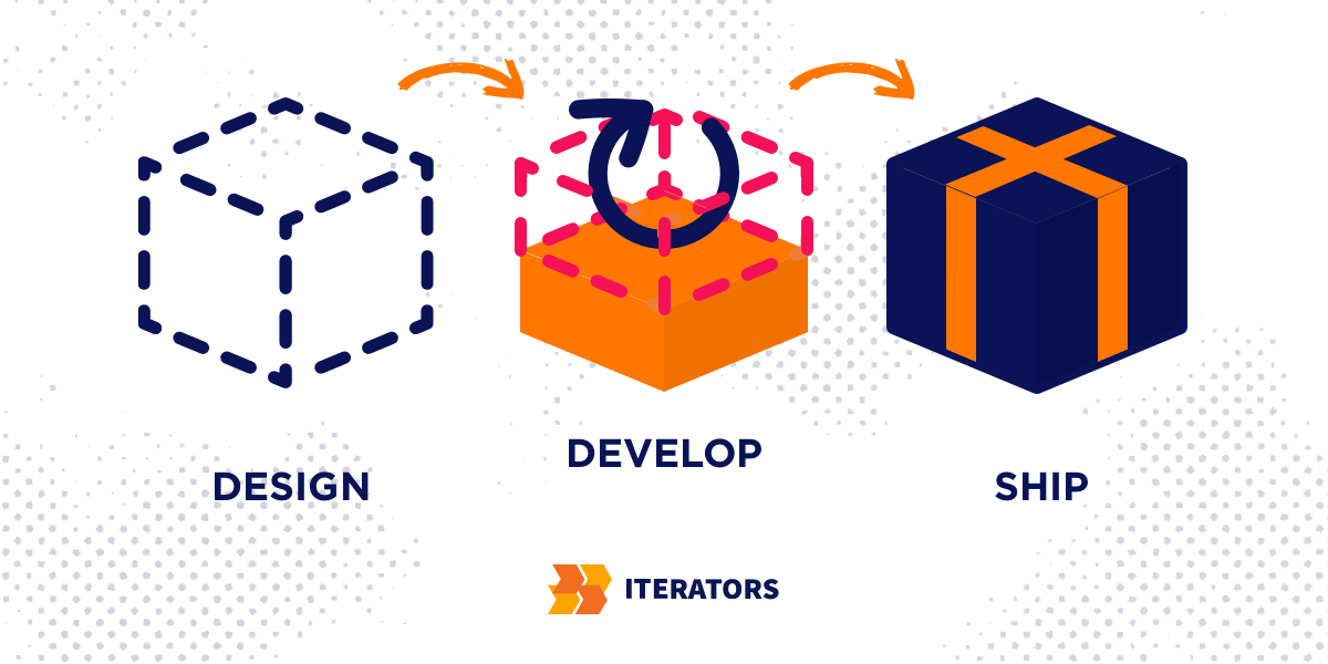
Ready to build an accessibility app that truly works for everyone? Our team specializes in WCAG-compliant development that expands your market reach while reducing legal risk. Schedule your free consultation to discuss your accessibility goals and get a roadmap for implementation.
